Outbound Sales KPIs in 2026: The Metrics That Actually Predict Pipeline, Not Just Activity
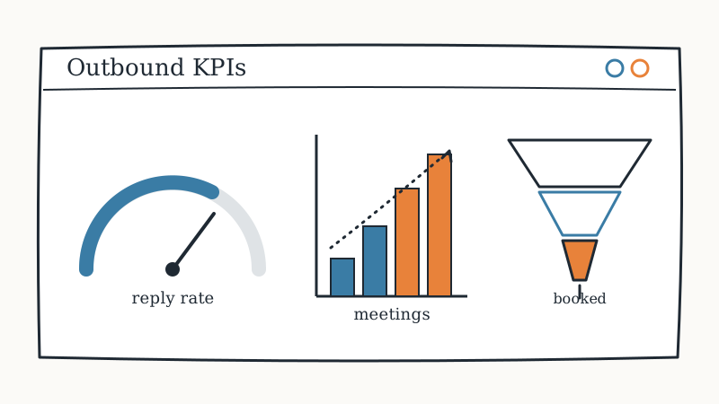
Most outbound teams measure the wrong things. They count emails sent and calls dialed, watch those numbers climb, and then wonder why the calendar stays empty. Activity is easy to count and easy to fake, which is exactly why it makes a poor KPI. The metrics that actually matter are the ones that predict pipeline: the ratios that tell you whether your list, your timing, your message, and your follow-up are each doing their job. This guide breaks down the outbound sales KPIs worth tracking in 2026, the benchmarks to expect, the vanity numbers to ignore, and how GroomLead instruments an entire outbound system so a soft number points to the exact layer that needs fixing.
What are outbound sales KPIs?
Outbound sales KPIs are the quantified measures of how efficiently a cold outreach motion turns a list of target accounts into booked meetings and revenue. They fall into three groups: activity metrics that count what your team did, efficiency metrics that measure the conversion rate between each stage, and outcome metrics that tie the motion to pipeline and closed revenue. A healthy dashboard reports all three, because each answers a different question. Activity tells you whether the motion ran, efficiency tells you whether it worked, and outcome tells you whether it mattered.
The single most important shift in 2026 is that efficiency and outcome metrics now carry the weight that activity metrics used to. When sending is automated and cheap, “we sent more” stops being an achievement. The question becomes “did more of what we sent convert,” and that is a ratio, not a raw count.
The three tiers of outbound metrics
Think of your KPIs as a pyramid. The base is activity, the middle is efficiency, and the top is outcome. A number moving at the top is always explained by a number at the base or the middle.
Tier 1: Activity metrics (leading indicators)
These are the raw counts of work done. They are leading indicators, useful for spotting whether a motion is actually running, but dangerous when treated as goals in themselves.
- Emails and messages sent across every channel in the sequence.
- Calls dialed and connects made per rep per day.
- New accounts and contacts added to active sequences.
- Sequence completion rate, meaning the share of prospects who received the full planned cadence rather than falling out after step one.
Activity metrics answer “is the machine on?” They do not answer “is the machine working?” A team can hit every activity target and still book nothing, which is why these never belong at the top of a scorecard.
Tier 2: Efficiency metrics (the ratios that diagnose)
These are the conversion rates between stages, and they are where the real diagnosis happens. Each ratio maps to a specific layer of the outbound system, so a weak ratio tells you exactly where to look.
- Bounce rate: the share of emails that never reached an inbox. A rising bounce rate is a data-quality failure, not a messaging one.
- Open rate: a proxy for deliverability and subject-line strength (and increasingly noisy as privacy features fire opens automatically).
- Reply rate: the share of delivered messages that get any human response. This is the clearest read on message relevance and timing.
- Positive reply rate: the share of replies that show genuine interest rather than an objection or an unsubscribe. This matters far more than raw reply rate.
- Meeting booked rate: positive replies that convert to a scheduled meeting.
- Show rate: booked meetings that actually happen.
Tier 3: Outcome metrics (the numbers leadership cares about)
These tie the motion to the business. They lag, so they cannot diagnose a problem in real time, but they are the reason the whole system exists.
- Meetings booked per week, the true throughput of the motion.
- Pipeline generated, the dollar value of opportunities created from outbound.
- Cost per booked meeting and cost per opportunity, the efficiency of spend.
- Outbound-sourced closed revenue and its win rate, the final scoreboard.
The outbound KPI benchmarks to expect in 2026
Benchmarks vary by market, deal size, and list quality, so treat these as reference ranges rather than promises. Their real value is directional: a number far outside the range points to the layer that needs attention.
| Metric | Healthy range | What a miss usually means |
|---|---|---|
| Bounce rate | Under 3 percent | Stale or unverified data |
| Reply rate | 4 to 10 percent | Weak targeting, timing, or message |
| Positive reply rate | 1 to 3 percent | Wrong audience or generic copy |
| Meeting booked rate (from positive reply) | 30 to 50 percent | Slow or poor reply handling |
| Show rate | 70 to 80 percent | Weak confirmation and reminders |
Notice how each miss maps to a cause rather than a vague “do more.” That is the whole point of tracking ratios: they turn a disappointing result into a specific, fixable diagnosis.
Which outbound metrics are vanity metrics?
A vanity metric is any number that rises without pipeline rising with it. The usual suspects are total emails sent, total activities logged, and raw open rate. They feel like progress because they always go up when you work harder, but they do not predict revenue. Open rate in particular has become close to meaningless as automated privacy scanners inflate it, so a “great” open rate can sit on top of a dead sequence.
The test for whether a metric is vanity or real is simple: if the number can double while booked meetings stay flat, it is a vanity metric. Keep it on the dashboard as a diagnostic breadcrumb, never as a goal.
How the KPIs map to the outbound system
Every efficiency ratio is really a report card on one layer of the outbound stack. Fixing the number means fixing the layer, and that is where the tooling comes in.
- Bounce rate reads your data layer. High bounces mean you are working an aging list. Enriching and verifying each record at the moment of outreach is the fix; Triguna returns current firmographic and contact data from a domain or profile so the record you send to is real today, not a snapshot from last quarter.
- Reply rate reads your targeting and timing. Cold sends timed to nothing land cold. Outreach timed to an observed event lands warm, and CAM monitors target and competitor sites for the changes that mark a buying window, so a fresh trigger enters the motion as a dated event instead of something a rep has to notice.
- Positive reply rate climbs with relationship warmth. The highest-converting outreach goes to someone who already trusts you. Champions surfaces the week a past champion changes jobs, turning a former user in a new role into a pre-warmed lead.
- Personalization consistency protects reply rate at scale. Quality that drops after the first ten accounts is a capacity problem, and VSDR deploys an AI sales development rep that researches and personalizes across the full multi-channel sequence at a human sending pace.
- Meeting booked rate reads your reply handling. A positive reply left sitting for a day is lost pipeline. Underfive.ai categorizes and drafts replies to inbound responses within minutes, so interest gets answered while it is still warm.
When those layers are instrumented together, a soft KPI is no longer a mystery. A rising bounce rate points at data, a flat reply rate points at targeting, a low booked rate points at reply speed. The metric names the fix.
How to build an outbound KPI dashboard
You do not need dozens of charts. You need one number per tier per layer, reviewed on the right cadence.
- Pick one outcome metric as the North Star. For most outbound teams that is meetings booked per week, or pipeline generated if deal sizes vary widely.
- Track the full funnel as ratios, not counts. Sent to delivered to opened to replied to positive to booked to shown. The stage with the steepest drop is your bottleneck.
- Attach each ratio to an owner and a layer. Bounce rate to data, reply rate to targeting and copy, booked rate to reply handling. A metric with no owner never improves.
- Review on two clocks. Efficiency ratios weekly so you can course-correct fast, outcome metrics monthly so you judge trend rather than noise.
- Segment before you conclude. A blended reply rate hides everything. Split by industry, persona, and signal type, and the winners and losers separate immediately.
What is a good outbound conversion rate overall?
As a rough end-to-end benchmark, a well-run outbound motion in 2026 converts roughly 1 to 3 in every 100 well-targeted, deliverable messages into a booked meeting, and a healthy share of those into pipeline. The exact number matters less than the trend and the diagnosis. A motion improving its positive-reply-to-meeting ratio month over month is winning, even if its raw send volume is flat or falling, because it is extracting more result from the same list.
The outbound KPI checklist
- Report all three tiers: activity, efficiency, and outcome.
- Make one outcome metric the North Star; keep activity as diagnostics only.
- Track the funnel as conversion ratios, not raw counts.
- Watch positive reply rate, not raw reply rate or open rate.
- Keep bounce rate under 3 percent by verifying data at the moment of use.
- Map every efficiency ratio to a system layer and an owner.
- Segment by industry, persona, and signal before drawing conclusions.
- Judge the motion by trend in efficiency, not by volume of activity.
Outbound is not an activity contest. It is a conversion system, and it performs at the level of its weakest ratio. If you would rather have that system built, instrumented, and run for you (with every KPI mapped to the layer that moves it) that is exactly the motion GroomLead operates for its clients: data, signals, relationship intelligence, sequencing, and reply handling measured and tuned as one accountable pipeline.
Ready to engineer your own GTM system?
GroomLead builds the outbound infrastructure behind 100+ agencies, and the tools inside this post.
Book Strategy Call